Back to top ↑
The Problem
Customers were not returning to the portal or utilizing all of the content that they paid for.
What is Lumina? Lumina is a startup company that creates shareable video job postings for businesses of any size. Their customer portal was functional, but cluttered and unintuitive. This resulted in a confusing experience for the customer and thus less engagement for the company.
What was my goal? My goal in this project was to establish a distinct visual identity for the customer-facing portions of Lumina's platform, and to reorganize the site's elements to encourage more user engagement.
Preview
*
Ideation
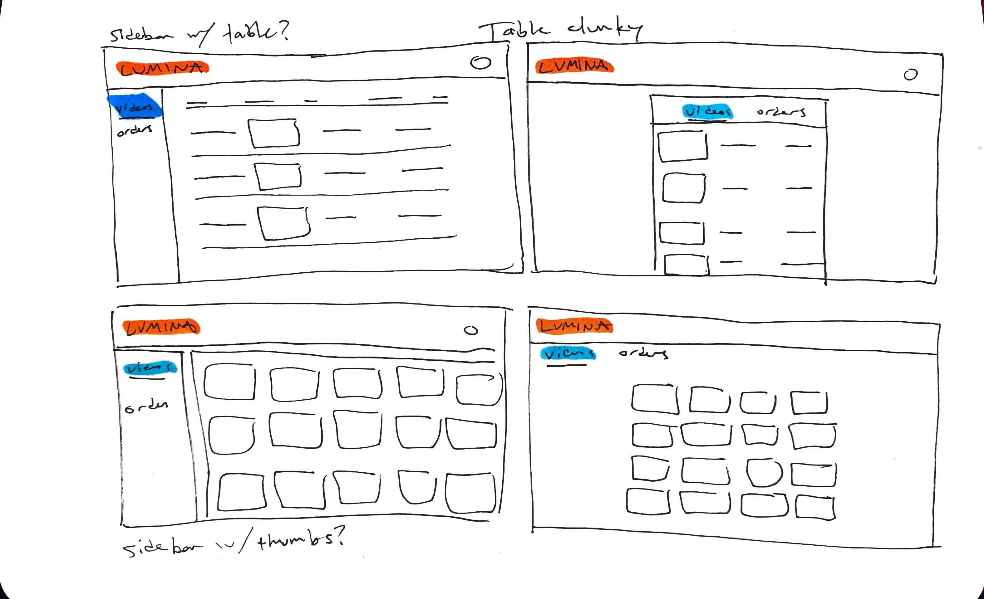
Drawing from Lumina's existing platform, I created some initial sketches for the redesign.
The site's existing layout consisted of a navbar and a centered content element with two tabs. I decided that a sidebar layout would be more intuitive for the purposes of the product.

*
First Iterations
I began by translating all of the platform's existing functionality to a new UX flow based on my sketches.
*
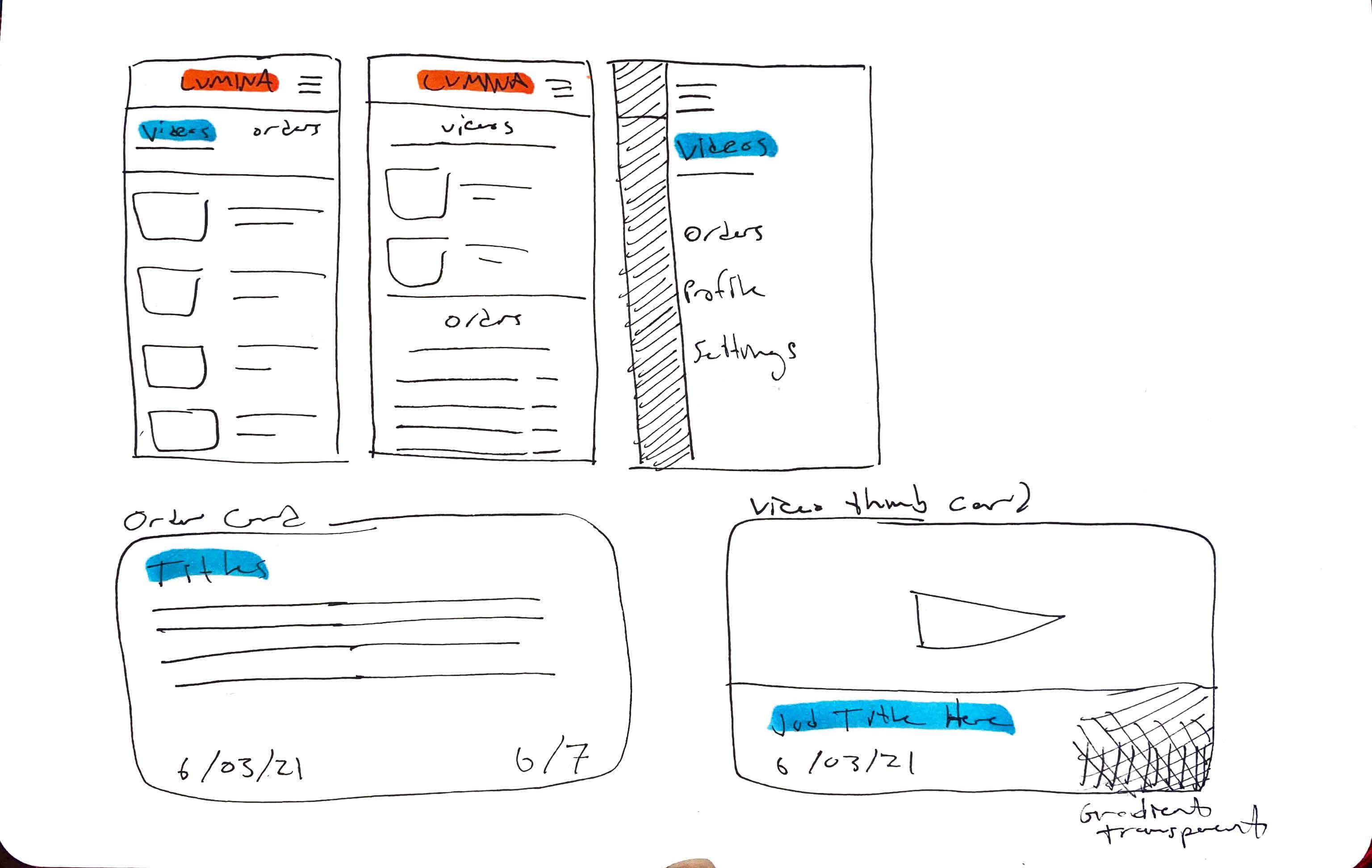
The "Videos" Page
After some conversations with the developers about my initial designs, we decided that a table view was not the most intuitive way to display the list of videos. Instead, I would have to find another solution.
Much of the information in the table was extraneous and not functional, so I decided to move it to the video details page and declutter the home layout.
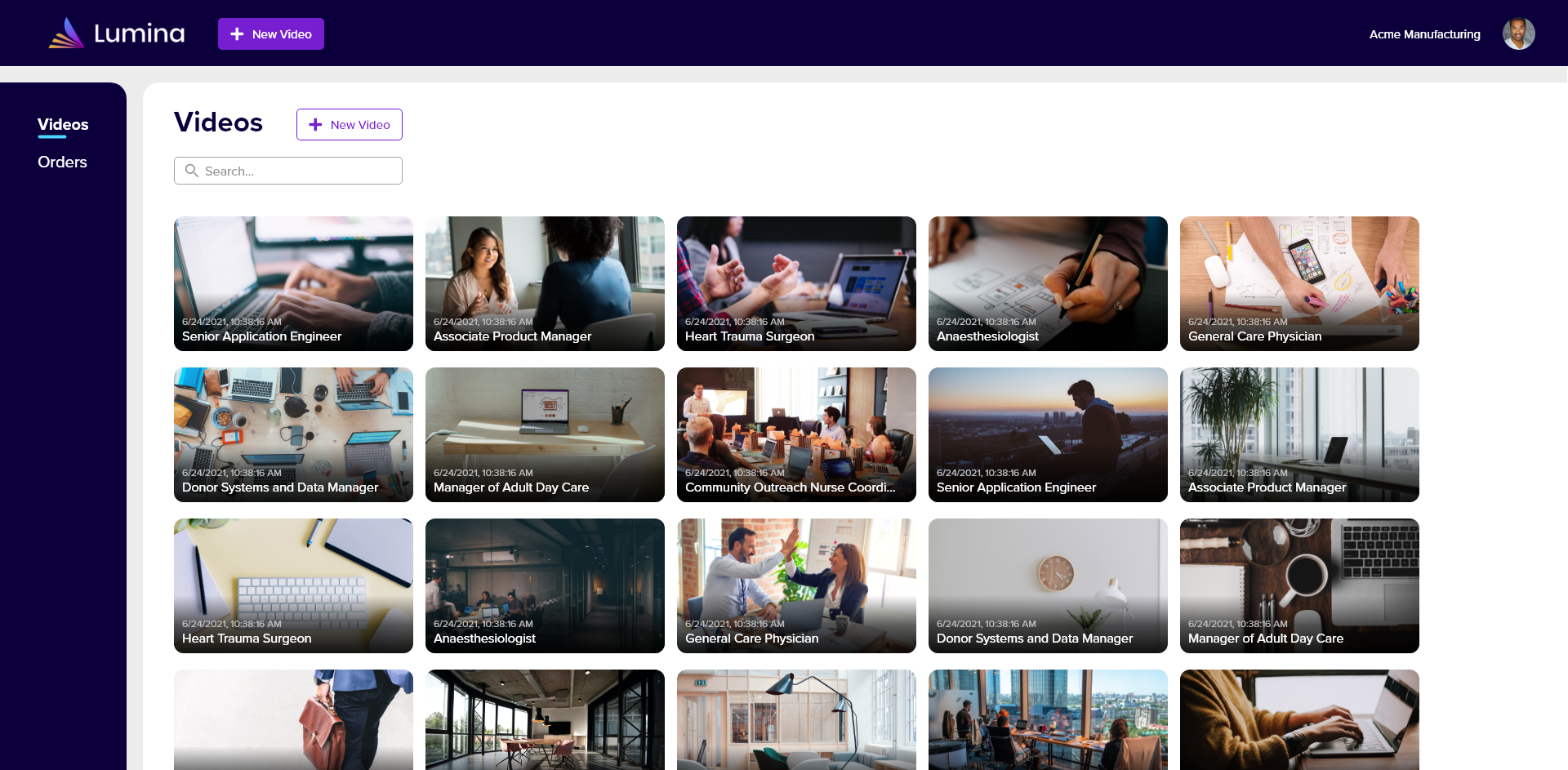
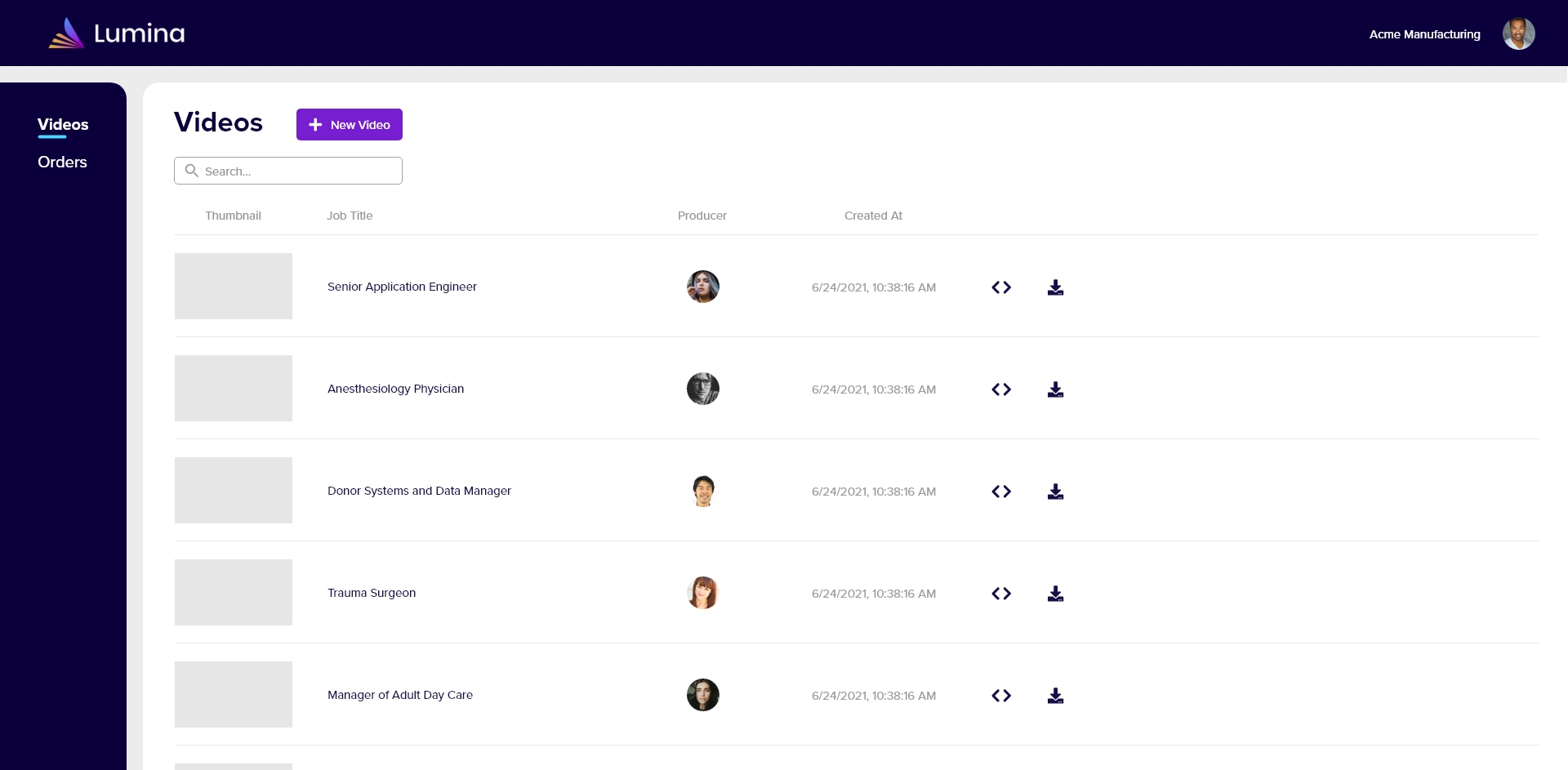
Since the only necessary items left in the table were the thumbnail, job title, and date created, I was able to make each video into a card instead of a table entry. This allows the user to see many more videos at once and more easily identify them visually.
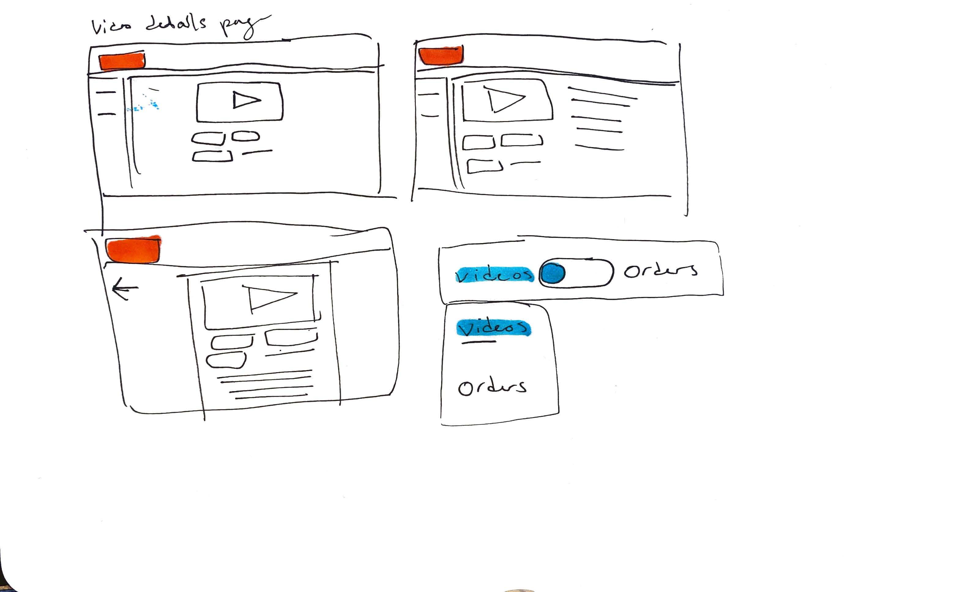
When implemented, my card design ran into a problem. The gradient idea did not work because the video thumbnails had text on them that would be covered, making them difficult to identify. Instead I devised a new view:

*
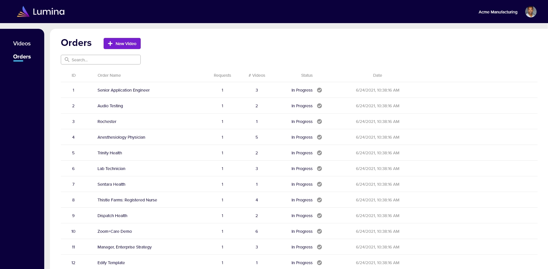
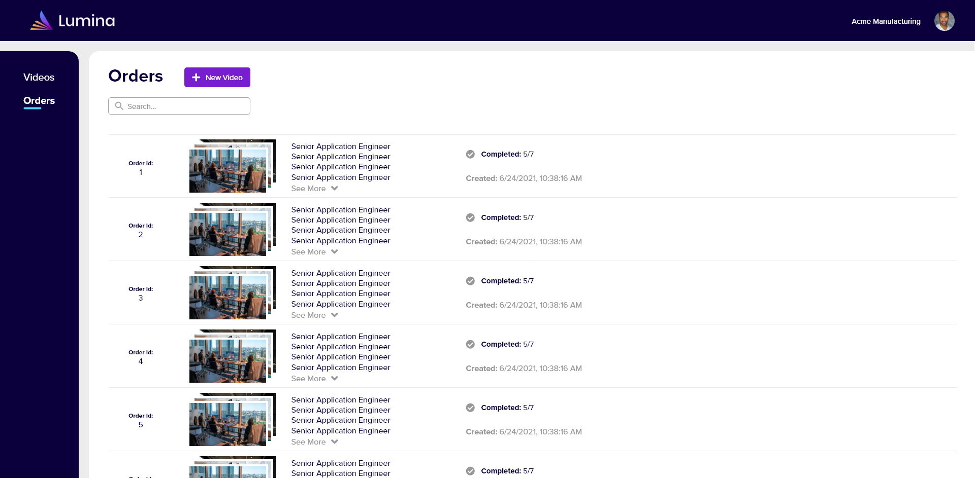
The "Orders" Page
My first design for the orders page closely followed that of the original; it had a table view with little information and its purpose was not clear.

This second iteration redefined the orders screen. Orders would no longer have names, but be identified by order IDs and their lists of job titles.
However, after discussion with the developers, we decided to do away with the table view entirely and add thumbnails to the order entries for greater ease of identification.
*
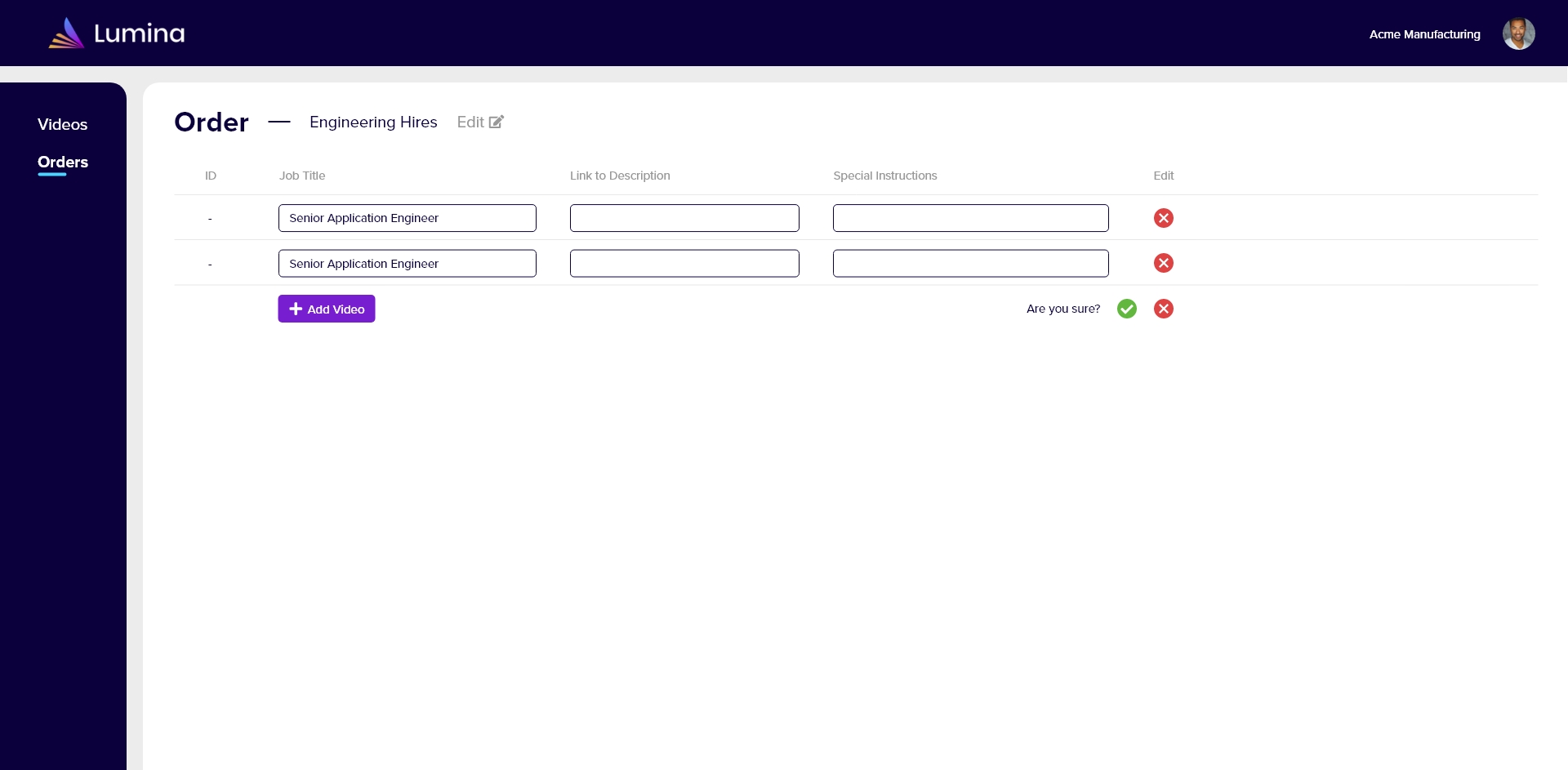
"New Video" User Flow
One of the most frequently-used interactions on the platform is the "new video" dialogue. This is where the customer enters the details of a new video request.
I added bigger, more visual buttons with hover interactions to the new video dialogue in order to promote more memorability and engagement.
*
Mobile Versions and Responsive Design
A design for the mobile version of the site was also very necessary. The current version of the product employs a very simple system for ordering videos, so it is likely that users may often choose to do so from their mobile devices.
While the 2-tab view was not intuitive for the desktop version, it worked great in a mobile setting.
The cards style of the video library also adapted well to a mobile context. Although the user cannot see many video entries at once on mobile, the search feature makes it very easy to find a specific video. The same principle applies to the orders list.
*
User Testing and Revision
After user testing, I discovered many areas for improvement in my designs.
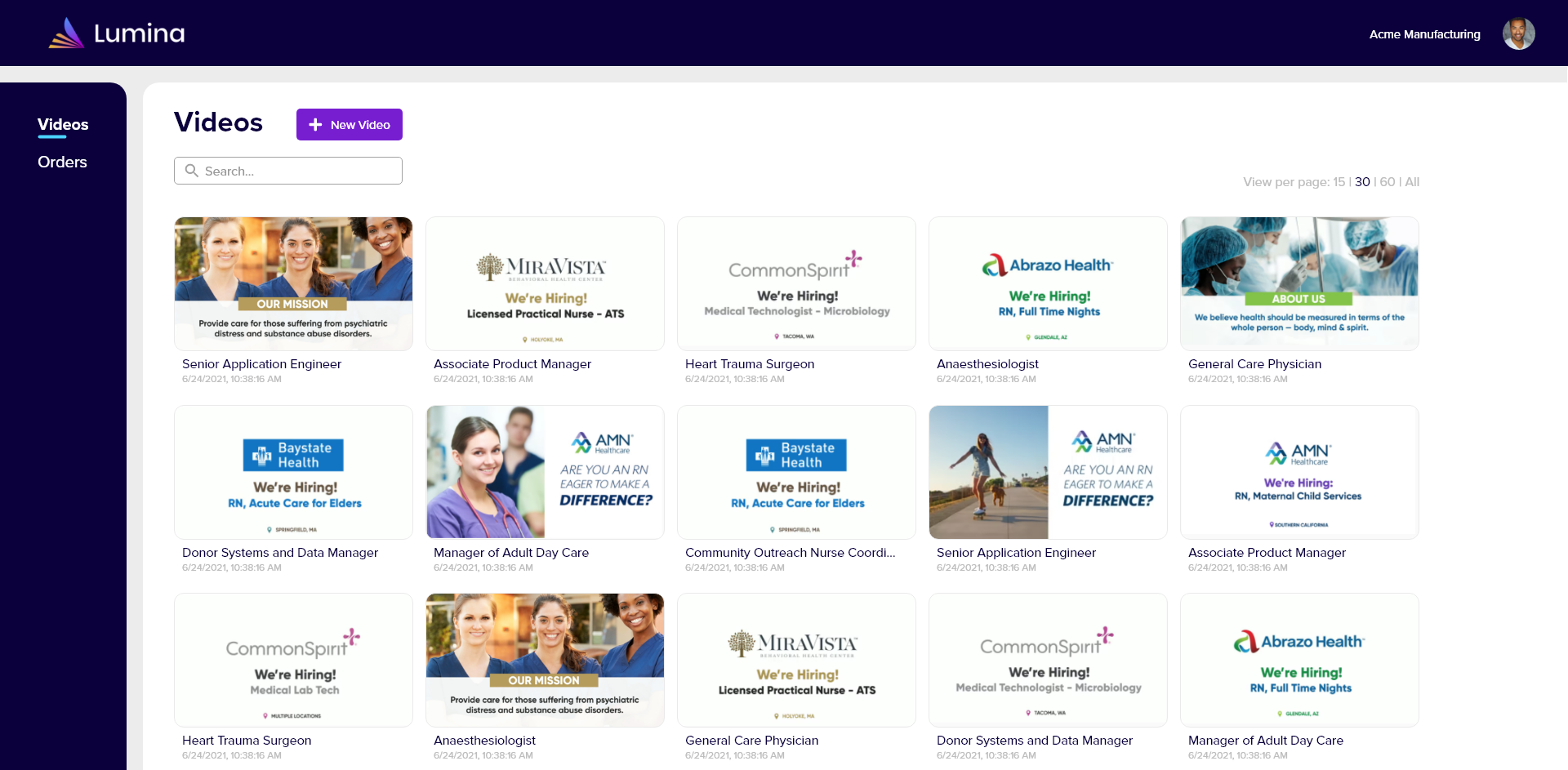
"Videos" Page
I had users go through the flow of creating a new video for a job posting and verbally explain their thoughts about each screen. They shared what thing they thought they could do and what their initial impressions were.
As it turned out, they were consistently not aware of where the already-completed videos in the library came from. Therefore, I adjusted the copy and implemented a tab view to make it very clear what the user is looking at and why.
Notification Center
When I had users come back to Lumina and try to determine the status of their ordered video, they were able to do so easily through the orders screen.
However, I felt that there were a few too many steps, and that there should be a feature explicitly dedicated to getting all relevant updates quickly. Therefore, a notification center was in order.
Tooltips
In the "new video" user flow, the user is presented with series of dialogue boxes to input information for their order. The last dialogue box is for "special instructions." However, there was no indication of what special instructions might or should be in this context.
So, I added a tooltip that appears on mouseover in order to clarify confusion.
*
Future Trajectory
This product is still evolving, being revised and improved constantly. Plans for a dashboard view that gives an overview of statuses, metrics, and more are underway, so this page will be updated in the future accordingly.
*
What I Learned
This project was the first in which I was able to work alongside developers and see my designs realized for use. The experience gained from collaboration and back-and-forth discussion was invaluable and has allowed me to better understand how UX relates to development.
This was also the first project where I was able to solve real problems that were reported by users and increase customer satisfaction by devising intuitive solutions.